The adidas Annual Report 2024 combines information on the last financial year with a bold design based on the “You Got This” campaign with the guiding principle “Plus One Effect”. It is also adidas’ first report fully compliant with the ESRS reporting standards.
The full-HTML report is at the heart of adidas’ reporting strategy. It does not only contain the whole content of the audited report, but it also includes special online only pages. As lead agency, nexxar is responsible for the creative concept of the online report and the design of the PDF version. Also, we take on the implementation of the online version and provide videos for the social media communication on LinkedIn after the go live. In collaboration with adidas, we focus on the best possible usability and user journey, an online-specific information design and digital storytelling.
-
Process
-
Services we provided
- Consulting
- Design concept & programming
- Motion design
- PDF design
- PDF layout support
-
Features
- Dashboard
- ESRS overview pages
- Snackable stories
- Interactive business model
- Special pages introducing Board members
- Social media assets
- Topic filter
- Power search
- Key figures comparison
- Animated charts
- Mark & share
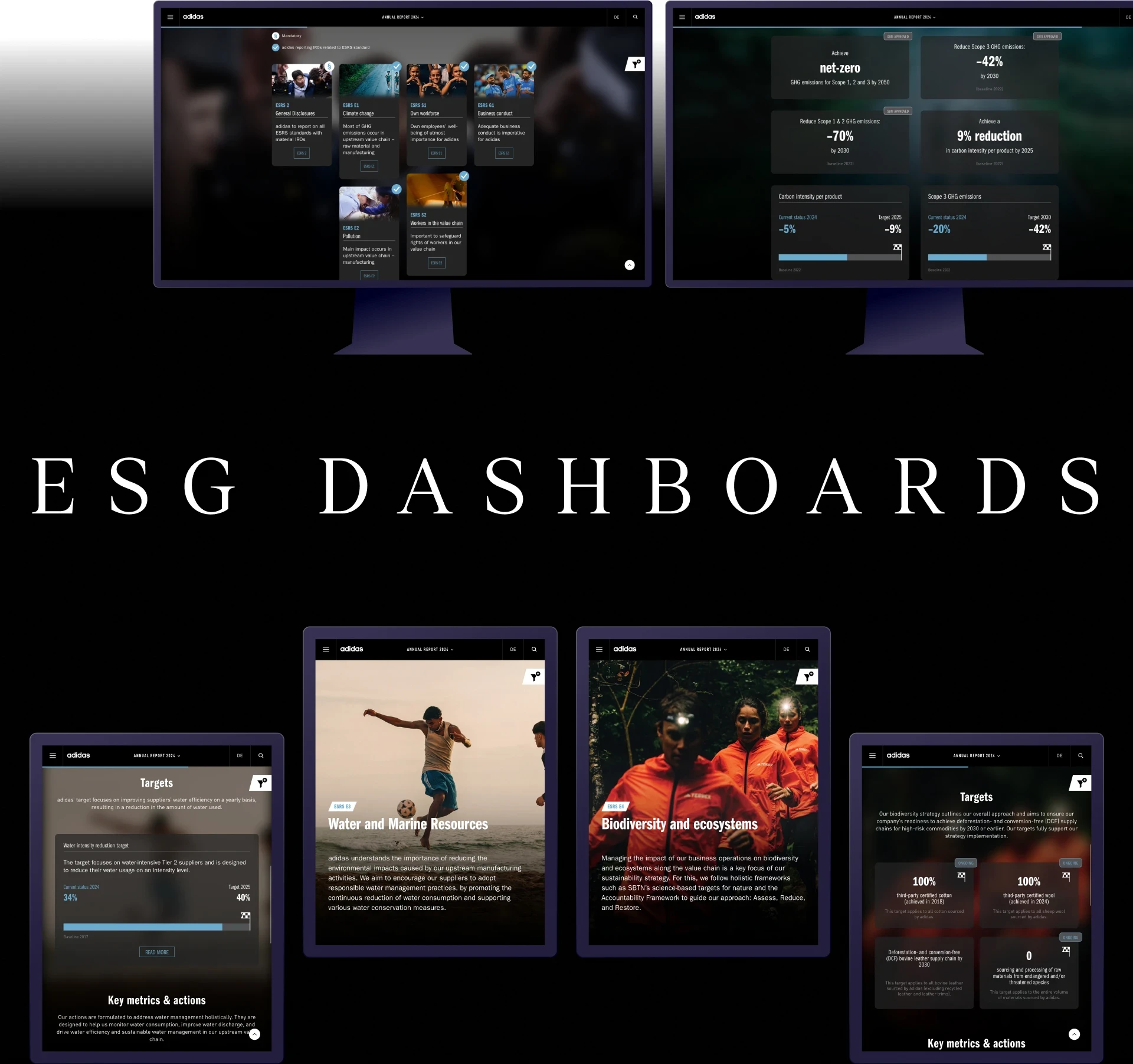
Snackable ESG Dashboards
The high-end ESG Dashboards are this year’s brand new feature and a highlight of the report: they provide you with an overview of the most important sustainability IROs, metrics and targets in a snackable way. If you wish to dive deeper into specific sustainability topics, related links will lead you to the desired content.
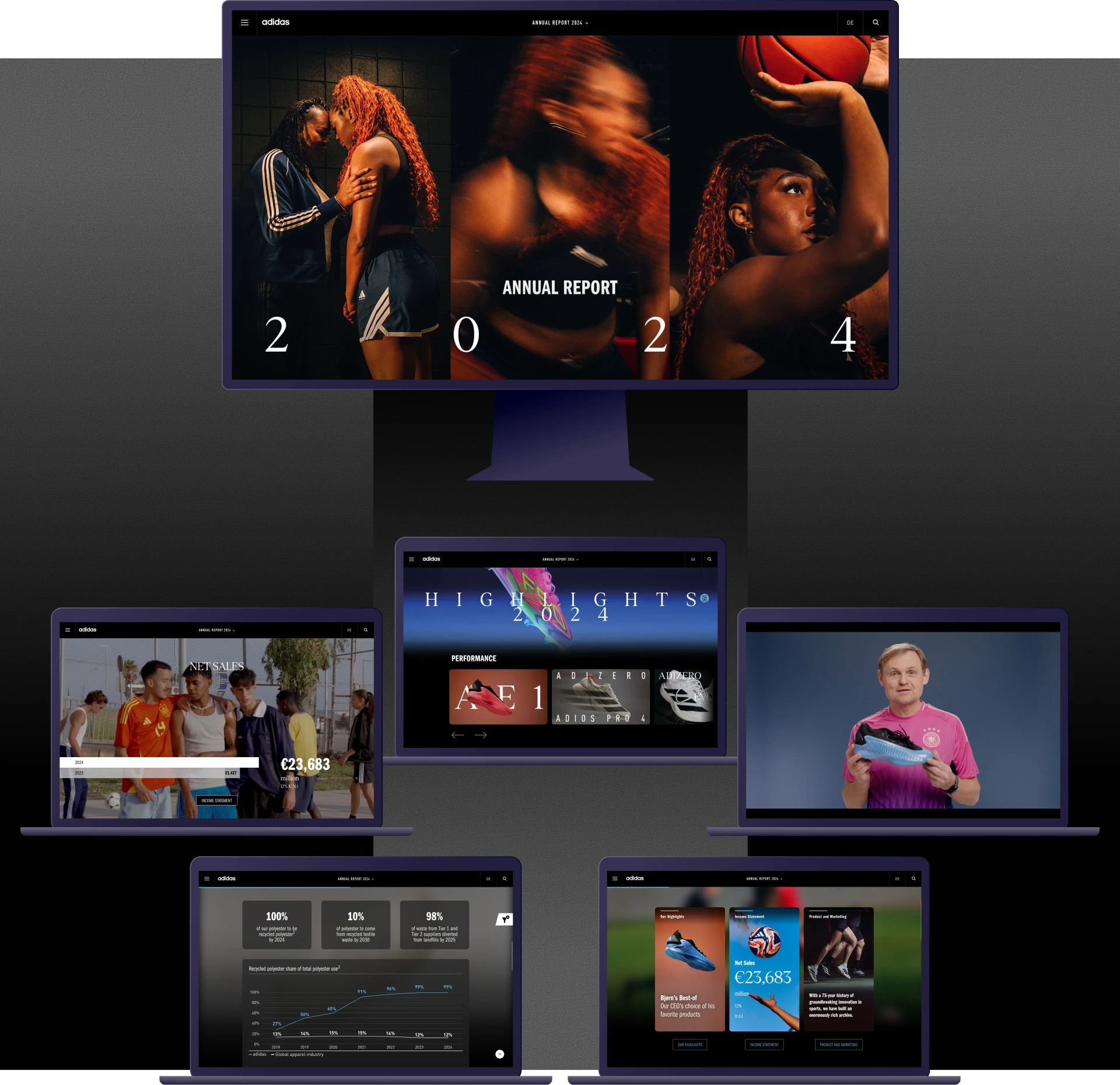
Vivid intro topped with gamification
The design of the landing page was developed based on the new tripartition branding element. The videos used here underpin, once again the importance of the “You Got This” campaign and lend the landing page a lively touch. If you are a quiz-fan, keep scrolling till the end of the page and you will be rewarded: a short quiz awaits and leads you to the highlights.
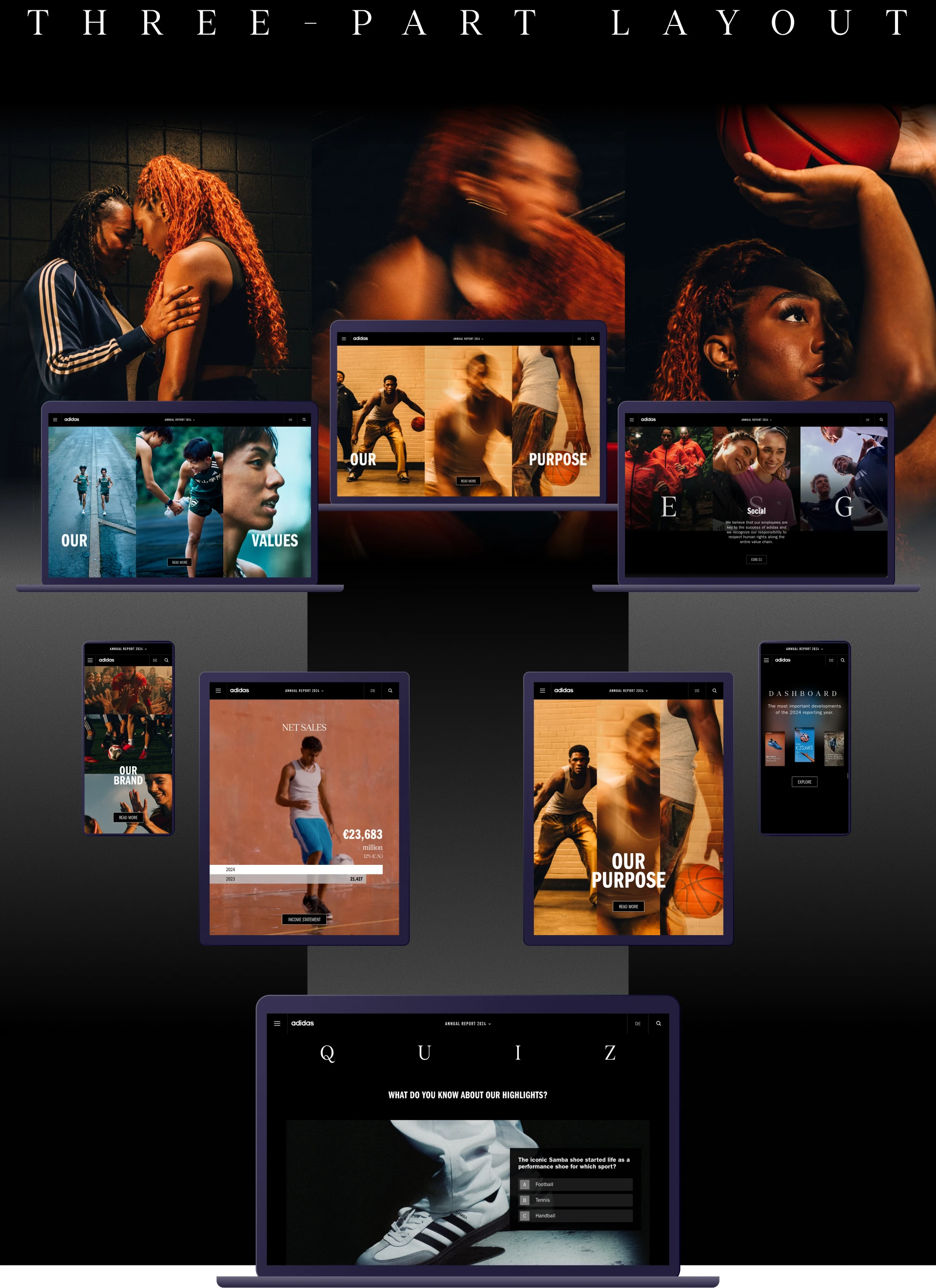
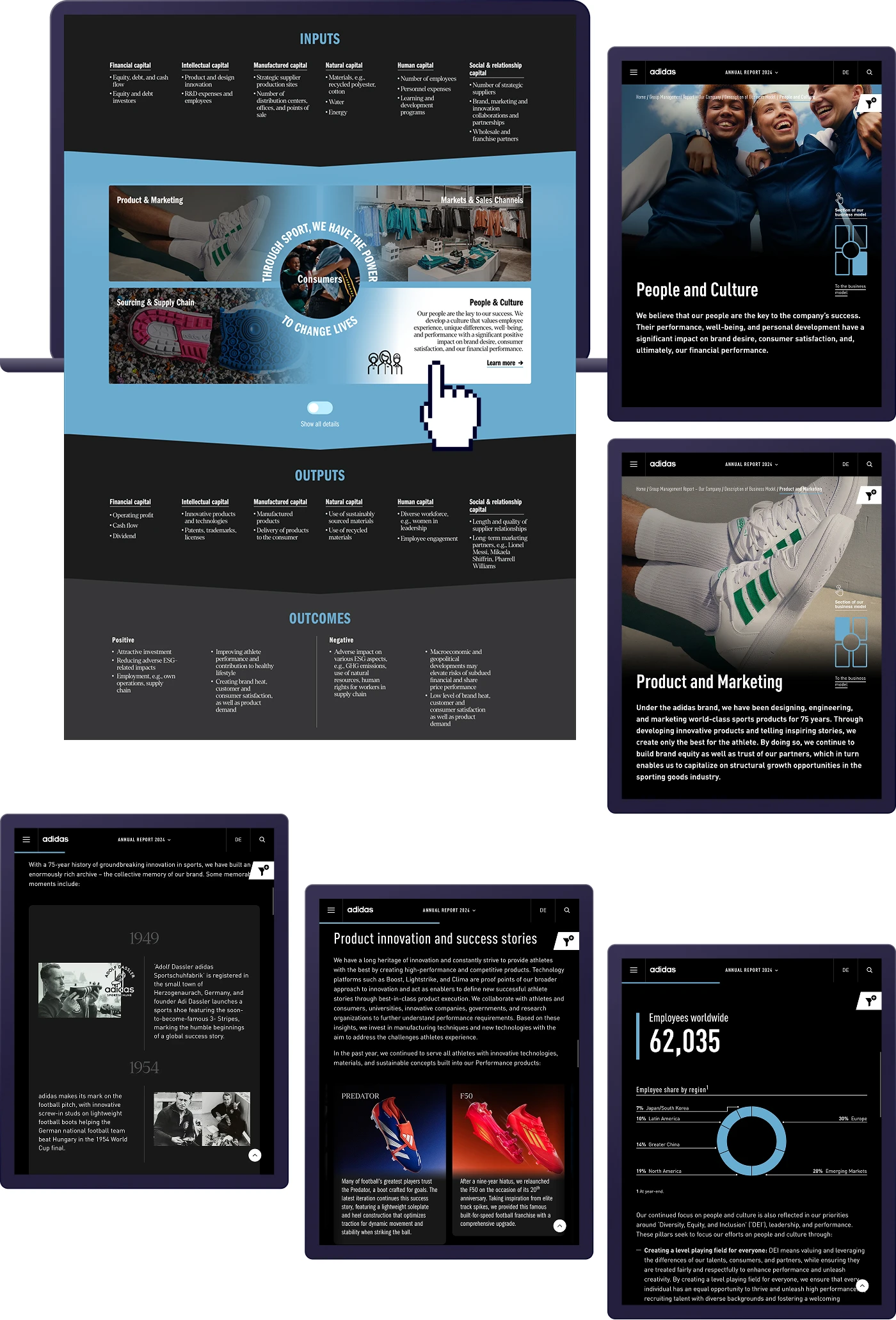
Business model upgraded
adidas explains how they create value in their upgraded interactive infographic. Stakeholders can discover input and output factors. By clicking on the factors, they can jump to the respective section of the report and find even more detailed information – timelines, product sliders, and even a navigation that helps you to jump between the different sections of the business model. The video in the centre of the graphic also shows what’s at the heart of the company: the consumer.
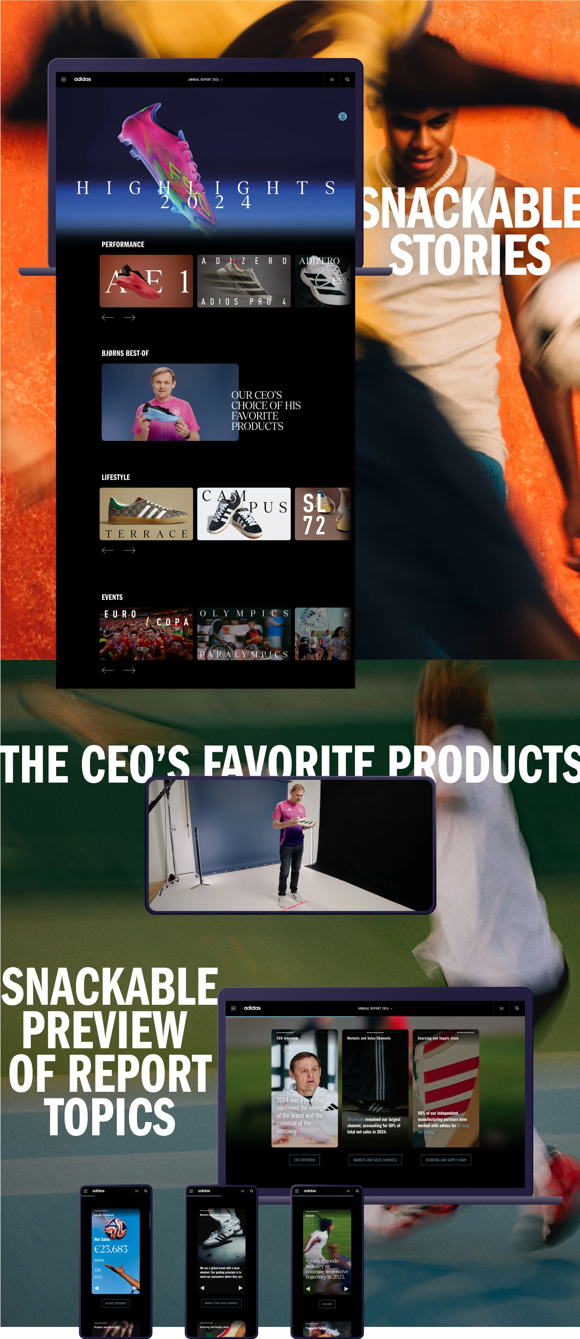
Highlights of the year
The art of keeping it short and simple is used on two different pages: the “highlights of 2024” are inspired by media centres. In brief stories, stakeholders discover events and products of the year, combined with microanimations and videos. Even the CEO reveals his favourite products in a short video message. The “dashboard” is the other page using snackable content. Inspired by Instagram stories, it provides short facts and figures about the last financial year, giving an overview of major topics covered in the report. If users want to know more about one topic, they can jump to the addressed content in the annual report by clicking on a link.